Kirk DouPonce
Kirk DouPonce’s website divides his portfolio into non fiction, fiction, young adult and “romancy schmancy” which I will just call romance. His sites list his areas of expertise as “Book Cover Design, Illustration, and Photography.”
Looking through his non fiction gave me the sense that his cover design is as much layout of other people’s images as his own so I went and read an interview to see if I could find out more about how much of the process he does himself. The question is the ever difficult one of “what makes an artist?” Is the person who makes a Coca Cola commercial as much of an artist as someone who orchestrates a performance art piece that they post on youtube? Is a web site designer an artist? At what point does digital collage have the same value weight as material collage? When does someone being paid to create marketing material stop being an artist? How does book cover art in general fit into that question?
From the interview I was able to learn two snippets.
One is he names refers to himself as a designer:
I’m always impressed with your type choices. What is your process when making your type decisions?
Like most designers much of my time is spent experimenting with different type treatments.
Two he does use stock imagery:
Where did you find your imagery?
I illustrated the border and skull. The image of the medieval soldiers came from ShutterStock.
The issue here is not that he refers to himself as a designer rather than an artist or that he admits to using stock imagery. The issue is his work looks like it was made by a designer not an artist and that the images look like a vaguely pleasant arrangement of stock imagery.
Since there are no dates marking when these images were made I went ahead and looked through everything he has in his online portfolio and of approximately a hundred images I found three that did not look like smoothly photoshopped advertisements. I’m going to consider these three the best and most original of his work and critique him based on those.
Though the fact that the majority of his work has all the creativity of a mass produced hotel landscape does influence my vote in regards to his Hugo Award nomination.
This image is labeled “ships5” when viewed alone. It makes very little sense to me as far as balance of imagery on the page or color distribution goes. I can see that it harkens back to the 1960s flying ship ideal and there’s a floating city of some sort but overall it just strikes me as a bland attempt at orange/blue contrast with some indecisive purple thrown in. The image itself doesn’t give a sense of story simply location and a bit of a confusing location at that.
Knife, or No Ordinary Fairy Tale, gives the impression that DouPonce put some additional effort besides arranging other people’s pictures. It doesn’t feel like a solid work though. I don’t know if it’s the odd way the color of the fairy’s tunic feels like the colors laid over dress images on Amazon or if it’s the fake feel to the ivy but it’s just not pleasing to my eye. I vaguely wish I had the layers he set up so I could rotate them here and there to see if I couldn’t get the balance on the horizon or some other aspect of it to lay better. I do like the texture on the fairy wings but it doesn’t contrast well with the green jacquard.
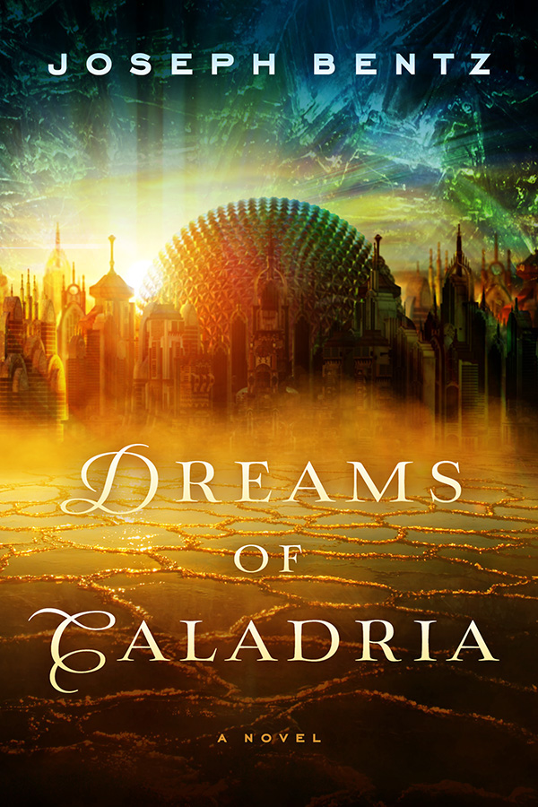
Dreams of Caladria also falls into that created but not necessarily interesting sphere. Busy but not interesting.
In conclusion, if I had a limited budget and wanted cover design for something that should be professional looking but not creative I would probably hire Kirk DouPonce. The fact that his works are interchangeable and don’t have a strong voice is a good thing in the marketing sense and a very good thing on a lot of non fiction covers. He makes sensible design choices and can balance an image in a very non-evocative way. Is he the Best Professional Artist? No.

I am wondering if “best professional artist” in the sense of book covers has a different meaning that in other venues? Book covers need to give a glimpse of what sort of story is inside while still being as broadly appealing as possible to try to entice people to pick up the book even if it’s not their normal reading preference. So, what’s best in a book cover would not at all be the best choice in some other format, even a print ad.
I think “designer” is a much more appropriate term for his work, though. I’m not sure where the line is between design and art, but book covers need a lot more design to them than a painting or many other art forms. He does a good job of creating pleasing, evocative covers. I feel like I know what kind of book it’s going to be from seeing the image coupled with the title, and that’s what a good book cover should do.
Thank you. I really have a hard time with this category. I suspect because while I was trained to critique writing I have never learned how to express what is appealing in art. This whole project is turning into a very interesting exercise.
Plus there’s a big difference between critique of the technical aspects and what’s appealing. Something can be technically flawed and yet still very appealing. It’s a bit of a muddy area anyhow, and then you throw in the differences between visual art in general and art for book covers, and things get even murkier.
I’m guessing he’s probably another racist homophobe. I’m voting no award. The whole thing is lame this year. Kinda want my 40 bucks back.
Oddly enough I never knew how Hugo Awards were chosen before this year. If it wasn’t for the crazies trying to game the system I would’ve never known I could participate. Does it balance? Nope. Is this my personal silver lining on the whole sharknado? Yep.
I take back my comment. He actually has four adopted children of color.
I don’t know anything about him personally and he isn’t whatever he is in so public a manner that encountering his views is nearly unavoidable. That said, having a child of color does not prevent you from being racist. Just like having a child who is gay doesn’t prevent you from being against gay rights.
I’m going on the assumption these days that no one is a racist or homophobic until proven otherwise. Even if they choose to do business with racist homophobes. I simply choose not to do business with racist homophobes. So if your only publisher is a one I will not be reading your work.